Articles
Category: Design Explained
Thoughtful Thursday #4
“Content precedes design. Design in the absence of content is not design, it’s decoration.”
jeffrey zeldman
This quote sums up why “can’t you just use dummy text and we’ll come up with the content later?” isn’t an ideal way of going about a design project. From the outside, design work looks visual – and most people don’t look any deeper than what is presented as-is to them. But the thing is, when we design, the colourful or styled parts – the visual parts – are the last part we work on.
We always start with your content: how much information there is, the hierarchy of the content, and what visual supports (such as infographics or icons) are needed. The content gets laid out before the visual parts of a design project are started.
I know that sounds wild to some of you and is possibly hard to get your head around, but this is why we always ask if you have your content ready before we start. We don’t use templates – your content dictates how the design will function. Otherwise it’s not communication, it’s just decoration.

Stock images: what if I don’t want to pay?
“Free stock images” is a strangely common request. There are valid reasons – sometimes as generic photos to create an atmosphere, or temporary fill-in photos (especially since COVID kept halting commercial photo shoots because of lockdowns).
But free stock images aren’t just “go and use as you please”. They also don’t come from a Google image search (we beg you: please don’t use images you find from Google – you need permission from the original website they were posted on).
If you are one of our clients, we share a range of stock image libraries with you which match your needs – some of these can have paid licenses attached, while some offer free licenses. If you are looking for stock images on your own, we recommend you read the license that comes with the image, as this will explain how you can use it (and usage varies greatly, depending on the library/image source).
Standard types of licenses (at a basic overview) include:
- Commercial: can be used for businesses and organisations. This is always what to look for first.
- Personal: for personal use only. Cannot be used to generate an income. Avoid these as you will be in breach of the license if you use them for a business in any form.
- Public Domain: no restrictions, no copyright claim. This usually applies to very old images which are out of copyright age limits, however you cannot claim them as your own.
- Creative Commons: the images may be used but in compliance with the stated restrictions. These restrictions vary but usually include the need to attribute/credit the original photographer.
- Royalty Free: you do not need to pay ongoing royalties for using the image, but there may be limitations imposed on how you use the image (eg. only on the internet, or a certain amount of print runs before you are required to pay). Some royalty free image libraries charge a nominal one-off per image licensing fee, but many are completely free to use.
If you ever get stuck being unsure about the license connected to an image you want to use, feel free to contact us and we’ll help you with checking if you can use a particular image for your needs.
Design is for communication, not decoration
Designers:
We are not decorators,
we are communicators.
Even on the smallest of projects, there’s a lot that happens behind the scenes that clients (and their customers) often don’t have the opportunity to see. We never start a project with the idea of simply making something look trendy or appealing – instead, the most important thing is highlighting what you want to communicate. That comes first.
This could be your contact details on a business card; how to make a booking on a poster; making your brand memorable on social media; your product name in an ad.
Once we have that goal planned out, then we work on how it looks visually – to be on brand, to capture the attention your potential customers, to be easy to read at a quick glance.
The design work we do has far greater placing on the thought process, rather than the final visuals you see. It’s that “hidden work” that makes design meaningful, attention-grabbing and connects with those who matter most to you. It changes design into an investment for your business communications, rather than being seen as a decoration service.
We aren’t here to decorate, we are here to communicate.
How do Pantone colours work?
Following up from our previous post, I’ll explain how Pantone actually works. It didn’t even cross my mind that this would be a question as Pantone has become so ingrained in our everyday work.
For us, selecting, referencing and using Pantone colours is as common as choosing what paper size we’ll use for a project. We barely give the background of Pantone a second thought anymore. But I realise from the outside, that it’s still all a bit of an unknown. It gives you more colour choices as a client, but what else? Why are designers always name-dropping these colours and numbers?
While Pantone originally started their system for printers and designers, their colours are not only used for printing on paper today; other materials include textiles and plastics. They simplify quality control with their standardised system.
Fun fact: in 1963 they started with 10 colours you could match. That number is a lot bigger now!
Looking for a colour beyond your printer?
The dilemma of standard printing is that you’re limited to CMYK. But what if you want a colour that’s brighter than what CMYK offers?
 That’s where Pantone inks come in handy! While they are more expensive to print with, if you are after a colour that can’t be made with CMYK (the inks your home/office printer use, and most professional digital printers use) this can be the answer.
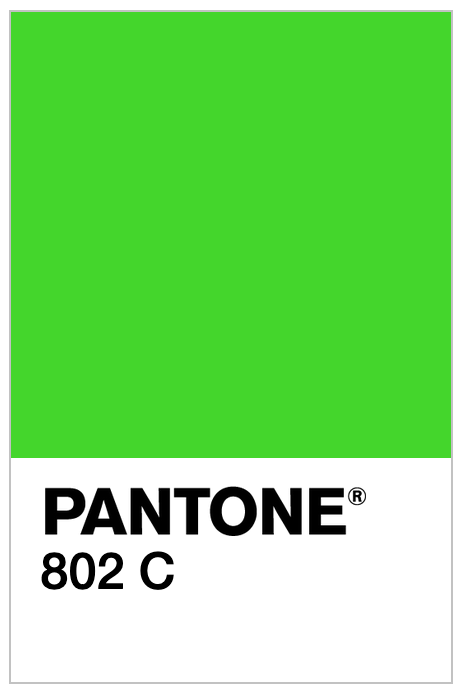
We recently had a client approach us, wanting neon green in their branding. Neon green isn’t possible to print in CMYK (it turns out a murky green), so we selected Pantone 802C. This green is so bright it almost glows on paper.
The other benefit of selecting Pantone colours for your branding is colour matching – this benefits even standard colours. This means when you go to get anything made – whether it be printing brochures, embroidery on uniforms, signwriting on your vehicle – the colours can be matched for consistency. Digital printing can vary in colour from printer to printer, so selecting Pantone colours can minimise discrepancies in colour. You don’t always have to print using Pantone inks (depending on the colour), but it’s a great reference for getting the colour right.
COVID-19: what to do with your time?
What a strange time we are living in – a pandemic, something that happens once a century.
Some of our clients are still going okay, but for many, they have had to wind down or temporarily close their businesses. We’ve had clients who have had to cancel or postpone events, too. The stress of losing income is really scary – but also trying to be remembered even while being closed. What do you do without money to spend?
You make the most of that time you would have been spending working in your business, working on your business. If you’re not completely tied down to entertaining kids who are home from school, this is the time to look at your online presence.
When was the last time you reviewed your website? If you haven’t had a chance recently, make time now to go through each page and update them. You might even have new products or services to add that you’ve been too busy to do – until now.
Have you got an online store? You could add descriptions to each product, helping your search engine rankings (SEO).
Have you got a blog? Don’t just use this time to add one blog entry – write as many as you can, so you can post them in the future when you’re too busy to write again (it will happen).
Have you got a Google Business listing? Look it up and check that it’s up to date. Google keep adding new fields to the listings, so it’s a good idea to log in and check if you have added everything you can – including photos.
How’s your social media going? Social media is your friend during a closure. Even if you are stuck at home, your knowledge about your industry and business is not forgotten. Record some videos, add photos, share previous reviews, share your favourite work memories. Show people that you are still indeed here and aren’t going anywhere.
Although some days feel like they drag on forever, the pandemic is temporary. This will not be forever. And you might not be feeling the most productive during such an awful time of uncertainty, but even if you write a list and do a task here and there – every little bit counts.
Microsoft Powerpoint: for screen, not for print!
Most businesses do some in-house design – usually basic office documents and forms. Sometimes this can extend to presentations, or even brochures. The types of programs used to create the artwork we have seen, have been quite creative, but not always ideal.
The tricky part is that nearly every office has Microsoft Office in their software. This comes with a range of handy programs, each with their own features. Publisher is really the “design” program of Microsoft Office, but we rarely see it used. It even handles CMYK colours (print ink colours!), but we feel it’s probably not utilised because it’s the lesser-known of the programs. And lesser-used = lesser-familiar, etc.
So we have artwork sent to us from Microsoft Word, Excel and Powerpoint. We even had one client build a webpage and get it online in Excel (you know who you are)!!!
The trend we see is clients get frustrated by the limitations of Word, and create what they want in Powerpoint instead. Word has print margins that, by default, won’t let you place anything outside them – leaving a big white border. Word also generally won’t let you position text “anywhere”, unless you get creative with text boxes. So the next best program for flexibility that we have all used in our life? Powerpoint!
The issue is that Powerpoint is not set up for print – it’s set up for screen presentations. It does have a lot more flexibility with positioning images and text, as print areas don’t matter on screen. It also allows you to shuffle pages around, which Word doesn’t. The flexibility makes it a much more friendly program to create artwork in, even though it’s not traditionally for print. The files from Powerpoint don’t save too well for printing either.
If you’re creating your own artwork in your office, try to stick to this guide:
Microsoft Word: forms, single-page flyers
Powerpoint: presentations on a computer/projector
Publisher: posters, brochures
Selecting Fonts: Commercial Licensing
There are thousands of fonts out there to choose from. But did you know as a business, you need to have a commercial license to use a font?
If you are creating anything for your business – whether your logo, a business card, packaging, social media images and so many more examples – you need to use fonts with a commercial license. A lot of free font websites offer personal licenses only, which many unsuspecting people don’t realise. Of course it’s always hidden in the fine print!
So how can you be sure you are using fonts with a commercial license? If you can afford to use a graphic designer or a design studio, they should help you select fonts that have the correct licensing. If you’re choosing on your own, there’s a few websites that are great resources:
Google Fonts
Google Fonts is primarily for website design, but the fonts can be used both in print and online. All fonts are open-source, which means they all come with a commercial license. All fonts on Google Fonts are free to use, which can also be handy.
The joy of Google Fonts is really for websites. We used to be limited in website design to only about 5-10 fonts that were available on all computers, while now we have close to 1000 fonts to choose from. And for brand consistency, we can either choose a similar print font, or use the web fonts in print (where appropriate).
Adobe Typekit
Adobe Typekit is available with a Creative Cloud license, and all fonts come with commercial licenses. However, Creative Cloud is a paid subscription service. Most designers and studios use Creative Cloud (it’s an industry standard), so if you have a designer working on your project, you should be able to help select fonts from Typekit.
Typekit is primarily made up of fonts suitable for printing, but many also come with web licenses. This can be handy when you want your brand to look consistent both in print and online. Typekit fonts are generally a little more sophisticated than Google Fonts, and come with more weights/styles (eg. thin, light, regular, medium, semi-bold, bold, extra bold).
They are both very handy font services – and you can browse both for free to find what fonts you need for your business.
Design vs Words
I was reading this article, and Carol worded something perfectly that I have to share with you:
Words are important. Design is important. One is not better than the other; both should be recognised as integral to clear communication.
Carol and we have run into the same issue with clients: sometimes, they want us to come up with a design first, and put in the words later. While that sounds great in theory, the words to be used are just as important as the design.
When we design something – whether an ad with five words on it, or a publication of 20,000 words – both have every part of the design of the text considered. The layout of those five words can completely change the rest of the design, depending on the words chosen. Or in the situation of paragraphs of text: each page is typeset to make sure the text is easy to follow from page to page. For example, we never leave half a sentence to follow after turning over a page – the sentence will always start on the new page.
The design of the text makes it readable, eye-catching, relevant. It’s not just about “fitting it in” – for us, that’s ignoring the sole purpose of why we use words: communication. If it looks “nice”, but nobody can absorb what is being said, there’s no point.
Similar to Carol, we have learned to write as part of design. Sometimes, there’s a simpler word that more people will relate to. Or a sentence structure that is quicker to the point. Or perhaps, an industry-relevant word that will reach the specific customers you are after.
Design is powerful. So are words. Both put together well are a powerhouse like no other – and we live for these moments in design. Never underestimate their power, separate and together.
What’s your story, and why does it matter?
Every business has a story behind it. What’s yours?
And why am I asking? It’s actually really important.
You might hear marketing consultants talk about USP’s (unique selling propositions). It’s what makes your business unique to your competition. But I find that clients sometimes get stuck in a rut trying to come up with a clever USP, rather than just looking at what they already have.
Why do we need to know? What makes your business unique shapes your brand, your business strategies, and nearly every aspect of design we are involved in with a business.
So I take a different approach. If you have been able to come up with a USP, that’s fantastic. But if you haven’t, that’s okay. You still started your business for a reason. You and your business have still been on a journey to get to where you are. And that journey is your story. Your uniqueness is probably lurking in that story. And that little gem we find is what will make your brand special.
We love listening to client’s stories about the how and why of their businesses, and turning them into something visual. So don’t be shy, tell your story. Don’t be scared by marketing talk. Your story might have all the answers we are looking for.
Kids are designing and they don’t even know it
Let’s get something straight: design isn’t the final product, it’s the process in making it.
We have had parents of kids who are keen on graphic design ask us, “what should my child be doing? Is there a class, should they do an art class? What will improve their chances of eventually getting a job in design?”.
To us, formal education isn’t everything. You learn to use design thinking from a very young age; if you’re reading this as a parent, your kids are probably already using design thinking and you haven’t even realised. Your kids may not have realised either, as they are likely just having fun “creating”.
Design is not about being a master of Photoshop or Illustrator. They are tools. Image editing programs are great fun to play with for kids, but they aren’t expected to learn it or go to a class about it. Experimenting in childhood is the best education – they learn during play. And there is a lot of design in play that is underrated.
A couple of great projects for kids to use design thinking while having fun:
- Create a board game. It might be redesigning an old game (maybe a new snakes and ladders board), or it could be developing a whole new game. Planning the game, writing the rules, creating the board/cards/pieces – every aspect pushes their thinking into new bounds.
- Write and illustrate a kids book. This can be made age appropriate – it doesn’t have to be complicated. After writing a story, planning out how many pages, where the drawings will go, and where the text will go all require design thinking. Is it the right amount of pages for the book to be bound? How will it be bound? It will sharpen their problem-solving skills too.
- Create an activity book. This could include contacting friends and family to find out what sort of activities their “customers” would like to do. Whether they are colouring pages, crosswords, puzzles, jokes, “find the object” pages – they all require their own planning and design. Most pages also can require a lot of manual drawing, which is good for honing their drawing skills.
The list is endless. The goal is for your kids to have fun. And whether they eventually go into design or not, learning how to use design thinking will set them up with an amazing skill for any job.
Brand redesigns can be simple
When it comes to redesigning a brand, we have found many clients have big ideas to completely reinvent their businesses. However, simple changes can have as big of an effect.
When you plan a brand redesign for your business, consider what aspects need to stay. “Starting over” isn’t always a smart move. If you’re planning on keeping your existing customer base, make sure there’s a link to your history so your customers aren’t alienated. In the same way we assume a person’s personality based on what they wear, a business’ personality is assumed in the same way by the look of their logo and brand.
Sometimes, not much needs to change. The logo might still be meaningful, but the colours might need a refresh. This is exactly the situation that happened for Views Cape Schanck. They first thought they had to reinvent the wheel with their brand. After revisiting their business plans, they realised that it wasn’t a full logo that needed to be changed – but it was mainly the colours that needed to change.
Below are the before (pink and black) and after (blue and gold). The V was so memorable we didn’t need to adjust it. But changing the colours completely changed the look and feel of the business. Sometimes simple changes are all your business needs.

Music, journalism, design = stories
Music, journalism and design seem very different. But in reality, they all share one common factor: they are the storytellers of our world.
Music shares stories through sound and words. Journalism shares stories through text and voice. Design shares stories through images. They each have their unique ways of telling a story, and all have their merit. What communicates to each of us is different – some people will connect better with music sending a message, whilst someone else may recognise and connect to a poster.
The journey I took to realise this has been a long one – it’s my lifetime story in itself.
Music
When I was growing up, I lived and breathed music. I still do, to be honest. From the ages of around 8–15, music ruled my life. I loved finding out what the message was behind each song, and would analyse the lyrics. I learned what stereotypical chords musicians used to convey specific emotions. I collected the ARIA charts each week, and analysed why certain songs did better than others, and what their meanings were – and looked for connections. I dreamed of getting to become a radio DJ and interviewing bands and artists, learning more about the background of their songs. I dreamed of getting to announce the ARIA charts each week, and discussing why some songs were doing better in the charts than others. I also had a yearning to design CD covers…
Journalism
As my teens went by, I looked at journalism as a whole – no longer just within the music industry. I realised that what I loved was getting to share people’s stories, through interviewing and presenting. Especially people and stories within Australia, for Australians. My work experience was shared between a printers and a music magazine, so I could cover all three bases (design, journalism and the music industry).
When I completed high school, my two top preferences for university were communication design and then journalism. I chose communication design…or did it choose me?
Communication Design
Years later, after I graduated, I realised that I found my calling. I was in the right place all along, doing what I dreamed of. I am sharing stories of people in Australia, visually, through design. And yes, I have even been able to design some CD covers in my career.
What should you take from this? Storytelling is in everything we do. There are many ways to share information. It can be shared through music, through journalism, through design. Different methods reach out to different people. My ability to share stories through design holds a special place in my heart. I am getting to share people’s dreams and passions with my visual skills. And I feel so honoured that clients choose us to help them share their stories.
Graffiti with Purpose
This is a paper I wrote quite a long time ago on graffiti with purpose, but I have never published it. Enjoy!
Design is all around us, even where we least expect it. Almost everything in our environment is designed in some way, shape or form – whether it is billboards and buildings, or even garden layouts and graffiti. Contrary to popular opinion, graffiti is its own art form. Although graffiti is often done in illegal places (such as laneways, train lines, walls of buildings), much thought is put into the design of detailed work.
A misunderstood form of art and design, “graffiti” is derived from the Italian graffio – meaning “to scratch/scribble on a surface”. Graffiti is a colourful art form, promoting the artist’s beliefs, opinions, and interests to their sub-culture peers and the public.
However, graffiti isn’t always illegal, and can be used to help the surrounds. Walls are often commissioned to graffiti artists to put their talent to accepted use within a community. When a high-quality graffiti artwork has been produced for the public to see, other graffiti artists will often respect the work and not paint over it. And because it is a clean and related mural, the surrounding environment isn’t degraded from poor graffiti that lowers the value of the suburb or city.
But not all graffiti is done as a “pretty picture”. Some graffiti is highly political, such as the message “No jobs on a dead planet” boldly painted onto an industrial chimney in West Melbourne. The Greens Party were the instigators of this large-scale message, specifically painted onto the chimney, relating it to the pollution the chimney once emitted – giving the message immediate meaning and recognition. However, it is also placed on that particular chimney, as it is in a prime position for many people to see it.
The message is painted in white, to contrast against the brown chimney for optimum exposure. If the message was printed in black, or even another colour such as blue or green, it would not be as visible as it is in white. However, white is also the colour of peace, implying the message is an appeal to the community, an advertisement for awareness. This is further reiterated with the use of the peace symbol at the end of the message.
And then there is stereotype graffiti, typically found in laneways and along train lines – places that aren’t policed 24-7. Stereotypical graffiti is often colourful, done in spray paint, and is a name or a word in an extremely freeform style of typography, presenting the public with an artwork made up of letters more than letters made into an artwork. This piece is painted onto a roller-door of a shop in the tiny Degraves St – a shop that isn’t even open on a Sunday, clearly being susceptible to graffiti. An interesting choice of location, however, as the outer edge of the shop “frames” the work, as if it was a painting in an art gallery. However, the tin would have been an issue to paint on, with the curves affecting the angles of lines and paint coverage.
This piece holds some “fashionable” aspects of graffiti from the present, being the use of clouds and sparkles behind the typography. It gives a dreamy feeling, assisted by the highlights with white and the use of the colour blue. The word used in the graffiti could be the artist’s alias, a word of meaning, or a bunch of letters meaning nothing (but look nice when put together). According to the publication Spraycan Art, Australian graffiti artists are known for using random, useless words in their works – whereas overseas in places such as New York, the words used in their graffiti are often the artists’ names, trying to outdo each other with the most well-constructed and artistic piece possible.
But when you look a little further into the graffiti of Melbourne, specifically into the laneway Centre Place – famous for its unique and sophisticated graffiti – quotes scatter the walls in obscure but deliberate places. They are specifically there for others to read and gain knowledge from, such as “before one acts, one should ask one self, ‘what would happen if all others were doing as I am doing?’” (pictured). This is placed on the dumpster near some crates – the access point to climb to do graffiti on the highest sections of the laneway. This means their intended audience would see the message on their way to doing graffiti in the laneway, and as it is in a place where a person would have to stop to climb, chances are they would stop and read the philosophy of graffiti. A quick scribble in permanent marker turns into a timely thought-provoking philosophy for everyone who sees it.
Then in the same laneway, part of the back wall is commissioned art space: the “Citylights” project. Created in 1996, the four illuminated light boxes have been host to many street artists, giving them a new medium to work with, and a new space of “legal” wall to display their work on. Some of the art presented has been rather political, and has been well-known for causing controversy – such as Regan Smith’s Citylights display “Crime Walls”. This edginess is typical of graffiti artists, publicizing the tougher side of life that many of the public tend to ignore. This piece was of the Melbourne underworld figures George Williams, Mario Condello and Dominic Gatto – including one panel which had the “I ♥ NY” logo with “Melbourne” replacing the scribbled-out NY.
Many people in Melbourne walk through Degraves St daily, and directly go past Central Place and see the Citylights project. It stands out in the darkened (but short) laneway, being lit all day and night. The boxes are made of metal and glass, so they are durable to the weather and aren’t too complicated to change the artwork in. They are high up enough to avoid most vandalism, and have lighting only strong enough to draw attention to them in the laneway, keeping maintenance costs down.
Graffiti artists are always finding new ways to present their art in public, whether it’s legal (like emerging projects such as Citylights), or illegal – like the sweeping craze of sticker art. Sticker art is cheaper than spray paint and quicker to place on a wall, rather than a large and complex mural-style masterpiece that can take days to complete. The stickers are made of paper with a print on them – typically white paper with black print – the cheapest print possible. The present trend is to use cartoon-style characters, part-whimsical, part-Japanese anime style.
They can range from tiny stickers to large-scale (up to 1 metre or more), and are plastered onto any surface that will let them adhere – walls, ceilings, doors, fences, and even glass. The fact they can be stuck onto many more surfaces than spray paint opens up new ideas of composition and location of art for the graffiti artists. For instance, this example (Cnr Elizabeth St and Flinders Lane) is positioned so it feels as if the character is walking across the windowsill, giving it new depth and life that spray paint cannot achieve. Sticker art has also begun its rapid rise due to the lower charges if the artist is caught pasting on a sticker, rather than the much higher fines given out for painting on property. This is because stickers are temporary and can be removed easier than paint, which is so permanent it could last for months to years depending on the weather conditions of the area, and the quality of the spray paint.
Graffiti is everywhere around us, whether we choose to notice it, or ignore it. It holds important messages and beautiful artwork, just like the professional design of billboards and shop fronts, although most of the public despise it as the majority of graffiti is deemed illegal. An art movement that is comprised of simple materials as spray paint, stickers, a free space and a little bravery, with the locations and colours being very important aspects of this often misunderstood movement.
Actual Centre vs. Optical Centre
One of those “design things” that you might not realise is a thing, but can bother your eyes: actual centre versus optical centre.
What am I talking about? When an image, a heading – anything visual – is centered perfectly on a page, our eyes don’t agree. It may feel like the image is lower than it should be. If you let your computer do the centering for you, it will make it perfect centre, but it won’t look perfect. It’s also called the mathematical centre or geometrical centre.
So what position makes our eyes happy? It’s called optical centre, and it’s just slightly above the actual centre, and slightly to the right. It’s ever so slight that you won’t notice it’s not mathematically correct – but it makes all the difference. Our brains process images that are placed in the optical centre much more positively; it’s comfortable for our eyes.
Just one of those little random design tricks for you today!
Style Guides – Keeping Your Brand Consistent
For those of you who are local to Somerville, you may have noticed that our big accountants in town have recently had a make-over! New name, new branding, new signage…new everything. We are the designers behind the new brand.
But the one important thing I stress about branding? Keep consistent. So for LBW Advisory, even more importantly as they have a number of staff, a style guide for use within their office was developed. A style guide is a handy reference tool so you don’t have to guess colours, fonts or anything else relevant to the brand.

Using colour as a key to save space
A common issue in print design: too much content and not enough space.
The typical solutions are editing content so it’s shorter, or going for a bigger sized brochure/poster/booklet. But sometimes we need to think sideways – sometimes, a larger document size isn’t available, or the content can’t be cut down any further. So what happens then?
This is where a key (or legend) often comes in handy. Keys and legends aren’t only used on maps, they can be used to categorise all kinds of information. Icons and colours are common elements that are used.
For the A Gender Agenda calendar, we were limited by space (A4 page) and had a set amount of events we had to make space for. A legend made up of colours worked best to save us space in this design. It also has the added benefit of being easy to quickly find events in each category. Design can be used in clever ways.

The importance of branding
A few weeks back, I presented a talk on the importance of branding for small businesses to members of Mornington Peninsula Weddings. Over the next few weeks, I’m going to post little snippets from the presentation – little bits to help you!
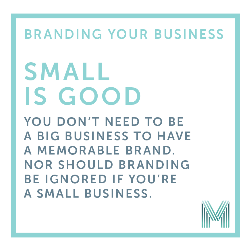
The top struggle I come across with small businesses, is that they think they are too small to worry about their branding. In actual fact, being a small business can work in your favour – you have more control over your brand and have the opportunity to make it unique to you.
Your brand isn’t just visual, it’s not just your logo or your website or your photos…the way you communicate and the words you use are just as important. There is also a human factor in every brand – the personality you share through your business (especially through social media!), counts as much as the visual aspects of your brand.
Start small. I often speak to start-ups who are totally overwhelmed by all of the things they think they need to get started, where really, most only need a few items to begin building their customer base. Nearly everything in life is easier in small steps, and branding your business is no different.
Don’t forget brand recognition. I know it can seem like a fun idea to regularly change your colours or logo, but a brand needs to be seen at least 3 times in 3 different places to be recognised. If you don’t have a consistent brand, the opportunity to build recognition is lost.
A strong brand for a small business can be huge in building trust with you, before a potential customer even makes contact. Make that first impression count. A quick template logo or something put together in Word might be the quick and cheap option, but it could be losing you customers you didn’t even know are out there.
My last tip: keep consistent. You can be a small business and have a great brand, with a bit of clever thinking and planning. It’s about being memorable, being trustworthy, being a brand your customers/clients/followers love.
Graphic Design for Tradies
We keep design simple, which although important for all clients, it is something which our trades-based clients seem to appreciate the most.
Often, tradespeople come to us without a logo, a brand, or anything much more than maybe a template business card or a newspaper ad. They usually want it to be no-fuss, so no fancy brand style guide, or complicated website…but they want to look good. So we focus on their brand looking consistent, choose colours that help them stand out from their competitors, and make sure all of their stationery and advertising (both digital and print) look professional.
We have had a number of tradespeople approach us over the years because they have used an online design template or printing service, and then found they can’t use the images on anything else…or there aren’t templates that look the same for everything they want to print. Designing a logo they can use anywhere is hugely important, as well as then knowing they won’t find another business using the same design, which often happens with online design templates!
When it comes to being online, we help with social media, Google business pages and their websites. In most cases, their websites are kept simple: often treated as an online brochure just so people can check out who they are and what they do, and see examples of their work. And then we update their website when they need, so they can focus on their work.
Our favourite part of working with tradespeople is that most of their businesses are as local as you can get, which makes working in Somerville even more amazing.
Promoting intimate local events
We often design posters and advertising for large-scale events, but we do occasionally design items to help promote much smaller events.
Events such as business networking sessions, VIP nights, open days and fundraising events are some of the types we’ve completed some graphic design for, but more recently we’ve been designing posters and flyers for special dining nights at The Winey Cow in Mornington.
One of these events was a cheese and wine night. As each event is themed, we create artwork to match the theme, while keeping their brand consistent throughout – so every event they run, the posters still look like a collection if you were to put them all together. Sometimes people get carried away with themes and forget about the presenting business or organiser on artwork. It’s worth remembering their brand is often just as important as the styling of the theme.


Choosing recycled paper for printing
When it comes to printing a project, whether it be a business card, a poster or a publication, there are a lot of paper options out there.
I have noticed an increase of interest in recycled paper stocks, but there’s a little bit of a gap in knowledge about what recycled paper looks like, and what the limitations are.
It’s quite a mixture of pre-conceived expectations that clients have about recycled stock too – it’s not just one thing. The top expectations are:
- Recycled stocks should have a particular “recycled” look about them.
Many clients have been surprised to find that recycled paper stock these days can look quite refined and smooth. - Brown paper must have a higher environmental rating than white paper.
This sounds logical in theory, but in practice it is not always the case. As an example, Buffalo Kraft (which is brown) uses 18% recycled fibres, whereas Cyclus (which is white) uses 100% recycled fibres. Looks can be deceiving! - There should be a laminated option for recycled stock.
This one floors me. Laminating, whether gloss or matte, is the application of a plastic film across a paper product. The plastic film used in laminating is non-recyclable, which would make a brochure printed on recycled stock with a laminate coating a contradiction.
I spend a great amount of time helping clients through the paper selection process, and make sure they understand the paper’s specifications, especially when choosing a recycled stock is of importance to them, their business and their project. It’s worth spending that little bit of time at the start to choose the right type of paper.
Mobile responsive websites
One aspect of webdesign that people are asking us about more and more is mobile responsive websites, so I thought I’d do a bit of an introduction on the what, why and how.
Now that most of the world seem to spend a lot of their time using their mobile phones for more than just making calls, websites are often looked at on those tiny little devices. I won’t deny that it’s super-convenient while you’re out to look up a business on your phone – it might be as simple as checking out their opening hours. It’s even more handy when the website is set up to be easy to view and navigate on a mobile.
When viewing websites became a thing to do on mobiles, it was standard to create a completely separate “mobile sized” website. These mobile websites often had different content to the main website, and often caused a double-up of having to update the content on both websites whenever information changed.
But HTML and CSS (the coding used for websites) has come a long way, and now it’s possible to create one website that morphs and resizes to suit the screen it’s being viewed on – and this is what is meant if you ever hear someone throwing the phrase mobile responsive into a conversation.
We are continually building websites with mobile responsiveness now, as well as converting existing websites to becoming mobile responsive. It’s a very important thing to note – you usually do not need a whole new website layout for it to become mobile responsive. So you can keep the website you love, but make it accessible for everyone, no matter what type of device they are viewing it from. Technology advances are amazing and wonderful in one!
Creativity is not just artistic talent
A few nights ago I watched Life at 9 on ABC – the episode was about creativity.
 What was most interesting was seeing how 9 year olds think creatively versus how adults think creatively. They were given a number of tasks that required problem-solving, and how the children and adults went about the tasks was amazing – along with how they perceive creativity.
What was most interesting about the tasks was that the children got straight into working it out – trying things, breaking things, trying things again – and not giving up. They were into experimenting and figuring out what works, but not being scared of what could potentially be a mistake.
The adults however, all talked in a group about how to solve the problem, and then began working…and then often found that their idea didn’t work in practice. There was too much planning and not enough experimenting. And creativity is all about experimenting – not being scared of trying something different, or trying something new. The children didn’t have fear of failure – just a will to make it work – and it was a beautiful thing to watch.
The other part of the documentary that was interesting, was the notion that both the adults and children had about what creativity is. Neither group really thought of creativity covering thinking and problem solving – they just assumed that creativity is only artistic talent. Creativity definitely isn’t only artistic talent, there is so much more. Creative thinking is really most of the process of every project!
Color IQ Test
This was HARD – square eyes occurred after completing this test.

Try it yourself: X-Rite Color IQ Test.
If you get the top score of zero (yes, that’s how it’s calculated), share it with us!
The difference between “brand” and “identity”
While the words “brand” and “identity” are used hand-in-hand, they are two separate (and very important) parts of any business.
The brand you create for your business is the emotional connection between your customers and the business; a brand can also be defined as the personality of your business. This can include the stories that support how your business is different to others, the mood of your store, the type of voice and words used to communicate to your customers.
The brand that is developed is then supported by the visual identity – which is the look and feel of all the designed items used by a business to distinguish themselves. A visual identity is not one particular item, but is a style, normally comprised from a library of elements, fonts, images and a colour scheme that give your business a unique identity.
And to throw a spanner in the works – when someone says they are “branding” something, they mean they are placing their visual identity on something to make it their own.
What is the difference between RGB and CMYK?
While this is a bit of a technical post, we come across so many people who don’t quite grasp the difference between RGB and CMYK. We don’t mind if you don’t understand because we can manage it all for you, but some people like to know all about it so we thought to dedicate a post about RGB and CMYK.
 RGB stands for Red, Green and Blue. RGB is the type of colour breakdown used on screens that transmit light – whether it’s your computer, TV or any other type of colour monitor. Websites use RGB colours.
RGB colours often appear brighter than CMYK colours because the monitor allows for neon colours that aren’t possible in CMYK. This means if you’ve got artwork that’s only been created using RGB colours, it can look very different when printed due to printing as CMYK.
 CMYK stands for Cyan, Magenta, Yellow and Black (key). Black is a bit special being called “key”, but that’s been derived from black being on the “key” plate when doing offset printing (in other words, the plate that does all of the detail printing, especially prevalent for books and documents with a lot of text).
CMYK are the colour inks used in printing. You may already be familiar with these colour when you’ve changed ink in your home or office printer – and a professional press is no different, just a lot bigger!
The easiest way to remember the difference:
RGB = on the computer screen.
CMYK = printed onto paper.
What makes up a logo?
First and foremost, a logo is a visual representation of your business to help others identify and remember who you are.
A logo is meant to be a consistent image, like a stamp. No element of your logo should change from document to document. It should also be the same on your business cards, website, flyers, vehicles, and signage.
A logo can be made up of text, an icon, or both. An icon is normally a symbol representing the business that can be still understandable whether in colour or black and white.
Logos do not include photos or large graphic elements. These are supporting items that can be used with your logo, but not in place of. Photos are often limited in their size and colour, making it difficult to use them successfully in a logo. They also can’t be enlarged the same way a normal logo is, so a photo will lose quality much faster than a text-and-symbol logo.
The text in your logo should also always remain in the same place, size and font in relation to any icons/symbols used. Treat your logo as one complete object, not a collection of separate elements, which will help present your business confidently each time someone sees your logo.
Logos often use a small palette of colours – 2, 3 or 4 colours are often popular. They create a colour scheme that is used across all of your business branding: brochures, website, business cards, signage and more.
If you’re concerned that your current logo isn’t really set up like a logo should be, give us a call and we’ll catch up for a coffee to have a look.